Create Your First Project
Start adding your projects to your portfolio. Click on "Manage Projects" to get started


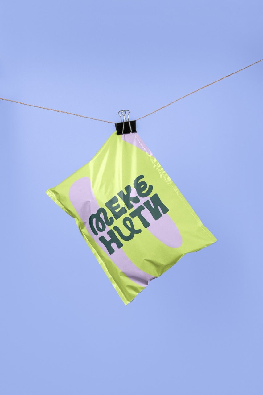
Meke Niti
Role
Visual Identity · Typography · Color System
Meke Niti is a young brand centered on handcrafted wool objects, rooted in tactility, softness, and manual process. The identity was developed to support growth across different creative fields while maintaining a clear and consistent visual foundation.
The system is designed to be structured yet adaptable. It establishes core elements that ensure recognizability, while allowing variation in how they are applied across contexts and mediums.
The logotype draws from the physical qualities of wool. Its rounded, irregular forms reference softness and handwork without becoming illustrative. The typography balances character and clarity, creating a distinctive presence that remains usable across applications.
The color system is built to carry both consistency and range. A deep green anchors the identity, supported by a wider palette that introduces contrast, energy, and flexibility. This allows the brand to shift in tone depending on context while staying visually coherent.
The intention is to create a durable visual framework that holds the brand together while giving it the capacity to evolve, extend, and translate beyond its initial medium.